How to Create and Style an Announcement Bar in Squarespace 7.0 & 7.1
When I started out an online business, I struggled to get customers to subscribe to my newsletter and promote my services. One thing I found that really helped was having an announcement bar. So I wanted to share that with you today, in case you are feeling stuck and need a little help, yay!
The first thing we all do is have a freebie to get your audience to subscribe to our email list. It’s perfect! I love freebies! BUT, what if they just shrugged it off, or they completely forgot about it?
Then you need something that can subtly appear everywhere on your website, right? So that’s where announcement bars are going to be the hero of the day!
In today’s episode, I’ll teach you how to add and style an announcement bar on your Squarespace website! Plus, I’ll also talk about why you really need to have one.
SO WHAT ARE YOU WAITING FOR? LET’S START!
FOR YOU NOT TO GET LOST:
Okay, so first, what’s the difference between announcement bars and promotional pop-ups?
An announcement bar is basically a header bar where you can showcase a message to your site.
It is one of the easiest ways to catch visitors' attention to inform new clients about your new services or announce limited-time discounts, or essential updates.
Except for cover pages, the announcement bar will appear on every page of your site. Note that users have the option to remove them while browsing your site.
On the other hand, a promotional pop-up is usually a small window that appears when you land on a website.
Some websites, however, use big pop-ups that cover the whole window. AND Squarespace doesn’t recommend that because SEO hates it (Oh no!).
There are also other forms of pop-ups like form blocks, including newsletter sign-ups or opt-ins and sale messages.
To tell you, when I see a screaming pop-up, I don’t read it, and I exit immediately. It really annoys me!
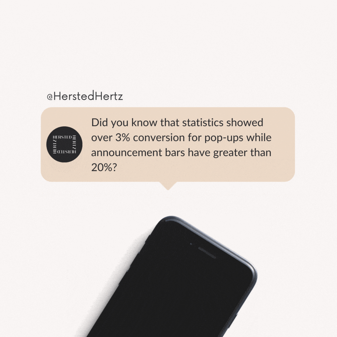
And I’m not the only one. Did you know that statistics showed over 3% conversion for pop-ups while announcement bars have greater than 20%?
People are more likely to exit a pop-up that covers the whole screen leading to a higher exit rate or bounce rate.
BUT, pop-ups are not entirely the antagonist of your website; with the right timing and sizing, they can also produce good results. So I recommend that you can use both, but always put yourself in the shoes of others and prioritize user experience more than everything.
I’ll talk about a promotional pop-up in-depth on my next blog. You can also read this post by Squarespace.
Creating an Announcement Bar in Squarespace 7.0 and 7.1
The good thing is this feature is applicable for both Squarespace 7.0 and 7.1, and it’s super-duper easy!
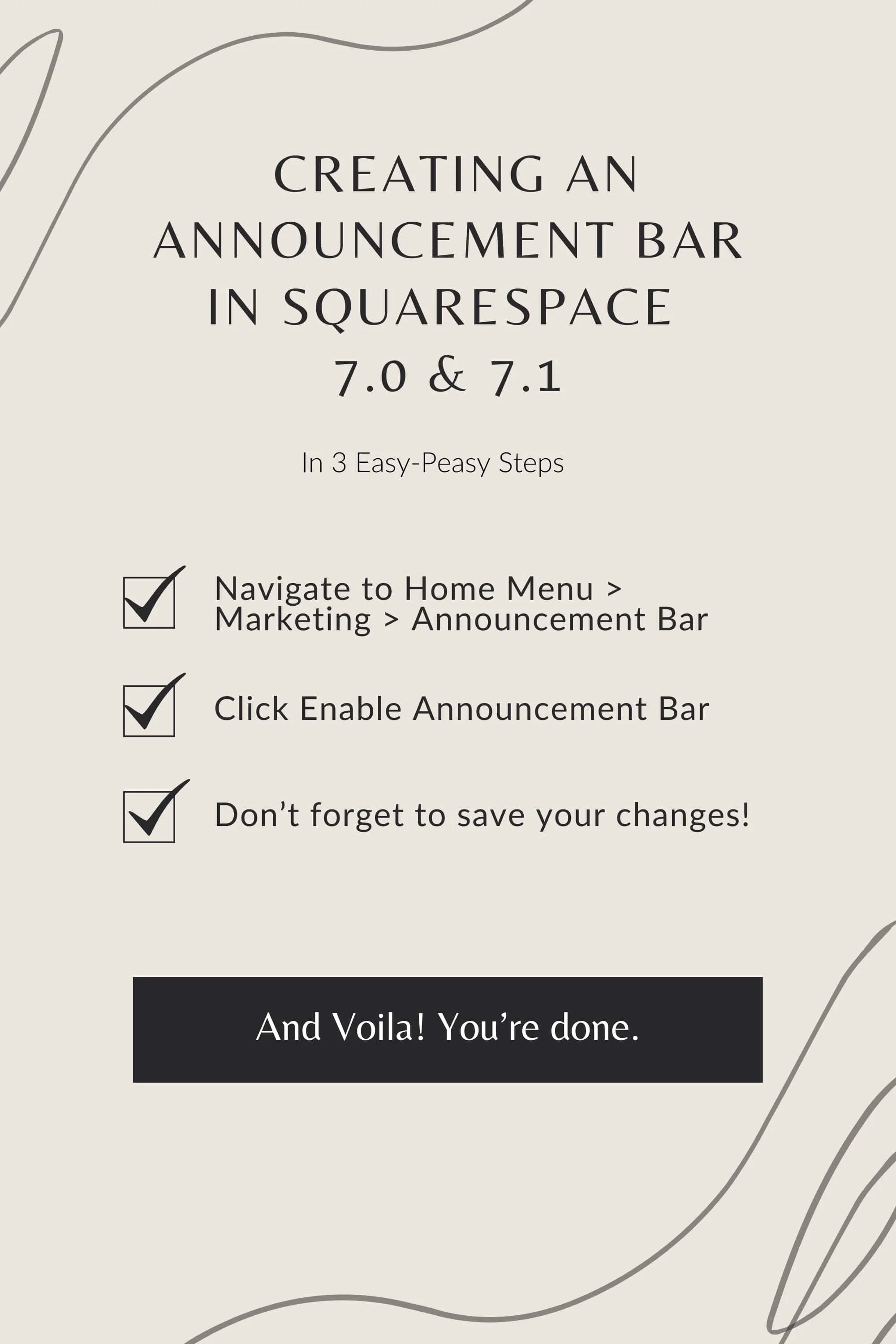
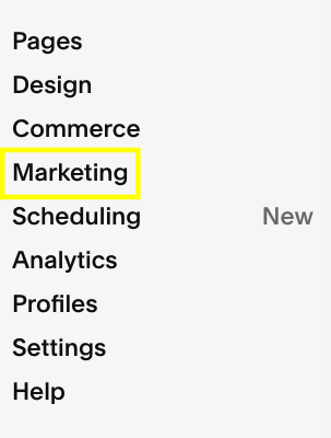
Navigate to Home Menu > Marketing > Announcement Bar
Click Enable Announcement Bar
Write your preferred text, and you can make it bold or italicized.
You can also add links where your audience can download directly or land them on other pages.
You can also turn the whole announcement into a link. Just enter the web address in the Clickthrough URL or tap the gear icon to set up various types of links.
Don’t forget to save your changes!
Example:
Customizing Your Announcement Bar
As I mentioned in my previous blogs, Squarespace really is perfect for DIY websites. Everything is customizable according to your preference, incredible, right? But for announcement bars, I suggest that you make sure that they will stand out but in a subtle way so that it can catch the attention of your visitors yet it’s still pleasing to the eyes.
CUSTOMIZING AN ANNOUNCEMENT BAR IN SQUARESPACE 7.1
To change the font:
Navigate to Home Menu > Design > Site Styles > Fonts
Go under Global Text Styles > Assign Styles
Go under Announcement Bar > Text
You can choose a preset style and size or tap Custom to style according to your liking.
Hit Save.
To change the color :
Note that the color of the advertisement bar always corresponds to the color header theme.
Navigate to Design > Colors > Section Themes
Hit the pencil icon of your header’s theme.
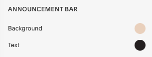
Go under the Announcement Bar to adjust the settings of the Background and Text.
Tap Save.
CUSTOMIZING AN ANNOUNCEMENT BAR IN SQUARESPACE 7.0
Scroll to Home Menu > Design > Site Styles
Navigate to the Announcement Bar settings.
Tweak the background color, text color, and font.
Hit Save.
Inspiration for Announcement Bars
BONUS! HOW TO KEEP YOUR ANNOUNCEMENT BAR OPEN
There’s a little tiny code that you can use to keep your announcement bar open.
Navigate to Design > Custom CSS
Paste the code below:
/* remove close button on announcement bar */
.sqs-announcement-bar-close { display: none !important
That’s it! Now you know how to add and customize your announcement bar. Make sure to maximize the potential of it and remember the user experience!
Reminder: Always give time to see your analytics and track conversions and bounce rates to see if it’s effective or affecting your SEO. From there, you can know what works and what you’ll need to improve. There are many ways to promote, so experimenting with what works the best is the key!
Related:
Bonus content!
Announcement bars can also be used to deliver a message to your visitors. You can post links for petitions, charities, funding drives, volunteer works in your area, and many more.
Also, always practice best design. I can’t emphasize this enough, but be sure that it’s readable enough for your visitors to clearly notice your message.
Don’t forget to leave a comment if you learned something today!
If you liked this post, Pin it to Pinterest!
For more information, visit this post by Squarespace.com.


