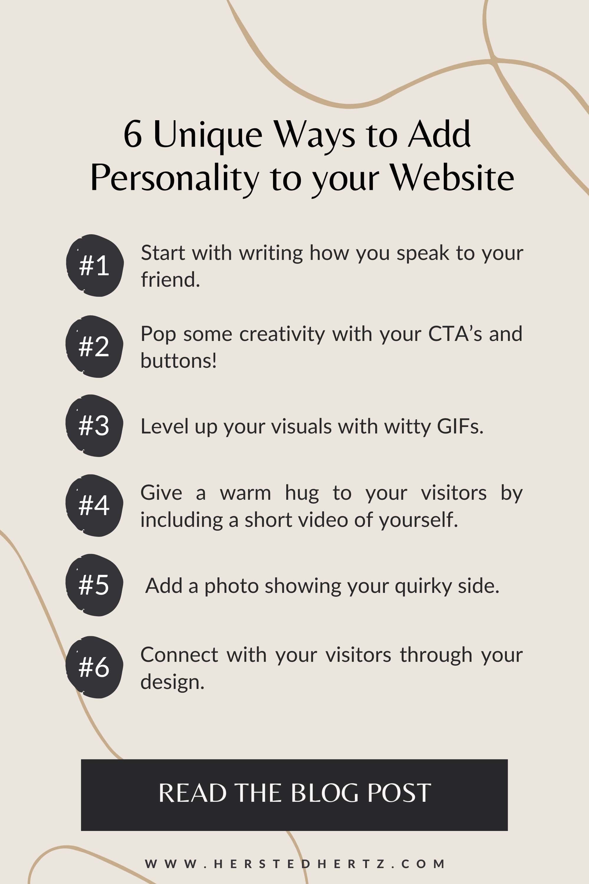
6 Unique Ways to Add Personality to your Website
I bet you are ready to launch your website (yay!). But wait, don't pop the champagne yet! Because this is a reminder to have a whole website check first.
Is there something missing? Is it too professional? Strong? Boring or Extra?
Does it have a personality to keep your visitors scrolling up until midnight?
Read on to know why having a fabulous online presence will make your website stand out from others.
THEN, OF COURSE, I’LL SHARE WITH YOU THE 6 WAYS ON HOW TO MAKE YOUR VISITORS LOVE YOU AND YOUR WEBSITE; YAY! LET’S GET IT ON!
FOR YOU NOT TO GET LOST:
6 Unique Ways to Add Personality to your Website
# 1: START WITH WRITING HOW YOU SPEAK TO YOUR FRIEND.
When I started writing content online, one hot tip from my colleagues is to write conversationally. And it totally makes sense!
Yes, being professional is one of the goals for having a well-crafted website, but too much will make it look scripted; yikes!
Writing in the way you talk to your friends will make your content much more approachable and easy to read.
PRO TIP: You can include stories like slices of your life when writing to make it more relatable. By connecting to your visitors, they can quickly build trust with your brand. Plus, it’s memorable and entertaining!
# 2: POP SOME CREATIVITY WITH YOUR CTA’s AND BUTTONS!
Ever wondered what CTAs are? I got you! These are the buttons or texts that prompt you to take action, like signing up for a newsletter or “read more,” etc. That’s why it’s called call-to-action or CTA.
Sometimes conventional phrases are bland, so why not pop your personality with your CTAs and buttons, right? Personally, when I see a creative CTA, I immediately smile and remember that website.
Reminder: But of course, just the right amount of creativity! Don’t be too extra since it can lead to misunderstandings with your visitors.
Try these out:
Rather than ‘Sign up,’ try ‘Sendt it!’
Rather ‘Download Now’ try ‘YAS I want that’ or ‘Grab X.’
Rather ‘Contact’ try ‘Talk to us.’
Rather ‘Connect to Socials’ try ‘Let’s be friends!’
# 3: LEVEL UP YOUR VISUALS WITH WITH GIFs.
Who doesn’t love moving images, right?
Not only do GIFs catch the attention of your visitors, but it also adds up to the personality of your website. You can check the famous GIPHY, or you can create your own in Canva.
PRO TIP: Be extra on your Pinterest visuals by having a GIF version of them.
For some inspiration, you can check these beautiful unique website:
# 4: GIVE A WARM HUG TO YOUR VISITORS BY INCLUDING A SHORT VIDEO OF YOURSELF.
I know that filming a video of ourselves is the last thing we want to do on our website. I can totally relate! But look at how Tiktok videos went from 0 to 3.5 million views within an HOUR. Yes, that’s the power of short videos; they keep users entertained and drive a LOT of traffic to your website.
But of course, we are not here to make Tiktok videos; instead, we are making a short video of yourself. So whenever you are comfortable and feel all the energy, record yourself and introduce yourself and your website, chat about the things you are passionate about, and share your values. Whenever you are feeling uneasy, imagine the camera like your friend.
You don’t need complicated equipment, trust me, just be yourself, relax and be natural and hit the record button. Your website will thank you later!
Some tips while filming:
You don’t need studio lights! Just Ms. Sun and her natural light are good to go/ Get the glow, girl!
Generate test shots to ensure the lighting and other details.
Avoid distractions in your background, aka clutter.
Wear clothes and accessories that highlight your personality. Want to be extra? Color code your outfits with your brand!
I’d recommend adding your short video on either of these pages:
About page
Services page
Thank you page (After submitting a form)
Of course, you can upload it to your Tiktok or IG Reel/Stories *wink* in the future!
Having a short video of yourself is like giving a virtual warm hug to your visitors to welcome them to your website.
# 5: ADD A PHOTO SHOWING YOUR QUIRKY SIDE.
Wait! Not that crying baby picture or your emotionless ID picture (omg, kidding)!
What I recommend is taking pictures of yourself in your natural habitat. Love reading books? Take a photo while holding one. A fur parent? Take a picture with them. Love cooking? Take a picture cooking your favorite recipe.
Showing a glimpse of your life can make you easily connect with your visitors. Remember, the “Know, Trust, and Like” is the key to converting leads to customers!
These pictures can be added either to your:
Homepage
About page
Contact page
PRO TIP: You can ask your friends for a mini photoshoot of you that is coordinated with the theme of your brand. Not only will it make your website look professional, but it will also make your website stand out from the rest!
For some inspiration, you can check the about me page from one of our clients:
# 6: CONNECT WITH YOUR VISITORS THROUGH YOUR DESIGN.
Another way to showcase your personality and creativity is through your design. You can make your website look less technical and more appealing by adding a variety of designs.
For example, do you love typography? Add it! Love DIY? You can add hand-drawn content to make it more personal.
Professional doesn’t always mean dull and flat. You can still put your creative juices to your website without making it look unprofessional.
Related: How to Add Custom Fonts to your Squarespace Website in 3 Easy Steps
That’s it! I hope I encouraged you to step out of your comfort zone and spice up your website, yay! I can’t wait to see your websites; drop the links below; I’m excited to see them!
RELATED:
BONUS CONTENT!
Having a personality on your website is like saying hello; I’m human in the digital world.
In the era of the high-tech world, I know we all crave something familiar and comforting, a human-like interaction. That’s one of the pain points that our topic for today touches.
By adding personality, you make your website like the crowd’s favorite coffee shop across the street; people can always go there whenever they want.
If you liked this post, Pin it to Pinterest!


