How to Create a High Converting Homepage
Planning what you’ll include on your website homepage feels big and scary at first, am I right?
Did you know that people only spend about 2.6 seconds skimming a section website before moving on to another?
Yes, you heard it right. It’s just a matter of seconds before they decide to explore your website or say bye.
Imagine this, your website is like the front display of your business where you can showcase the main elements of what you offer. It is the landing page of your website, meaning it is the first thing people will see when they click your URL.
Thus, most of the traffic goes to your homepage, making it extra essential since it highly influences the conversion of leads to customers. Therefore, first impressions here are really important!
Generally, an effective homepage showcases what you offer, provides the best features of your business, communicates with your visitors personally, and includes a call to action to keep them engaged.
HERE’S HOW I HELPED MY PAST CLIENTS OVERCOME THIS HURDLE. I MADE A BREAKDOWN OF ESSENTIAL ELEMENTS YOU CAN INCLUDE ON YOUR HOMEPAGE.
How to Create a High Converting Homepage
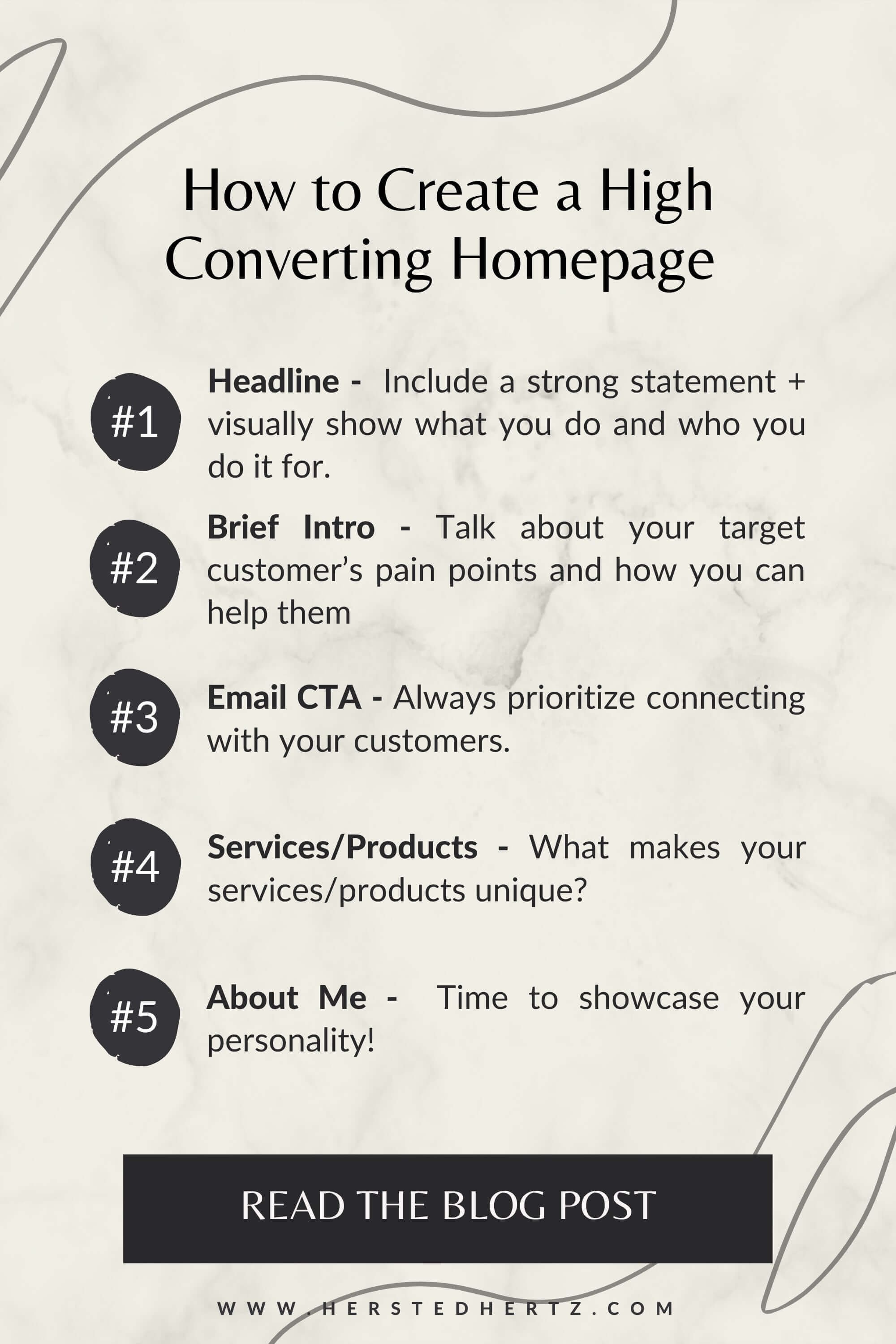
HEADLINE
Your headline is the first thing people will see on your website. So include a strong statement and visually show what you do and who you do it for.
PRO TIP: Catchy quotes are a plus, so make it count!
2. BRIEF INTRO
The best strategy here is to talk about your target customer’s pain points and how you can help them. Give emphasis on the benefits of working with you.
3. EMAIL CTA
In reality, most of your visitors won't immediately be your customer, so it’s essential to provide an option to keep them connected with you. With this, they’ll eventually trust you as time goes by.
PRO TIP: You could showcase here your freebie to sign up people in your mail list!
4. SERVICES/PRODUCTS
What makes your services/products unique?
Provide the primary services/products you offer and include a short description of their purpose. Of course, also put call-to-actions to land them on your services/products page.
5. ABOUT ME
The “Know, Like, and Trust” part of your homepage. Time to showcase your personality!
Give your visitors a peek of who is behind the business to connect with them.
I talked about the essential elements your About Me Page needed, check it here: 5 Things you Must Include in your About Me Page.
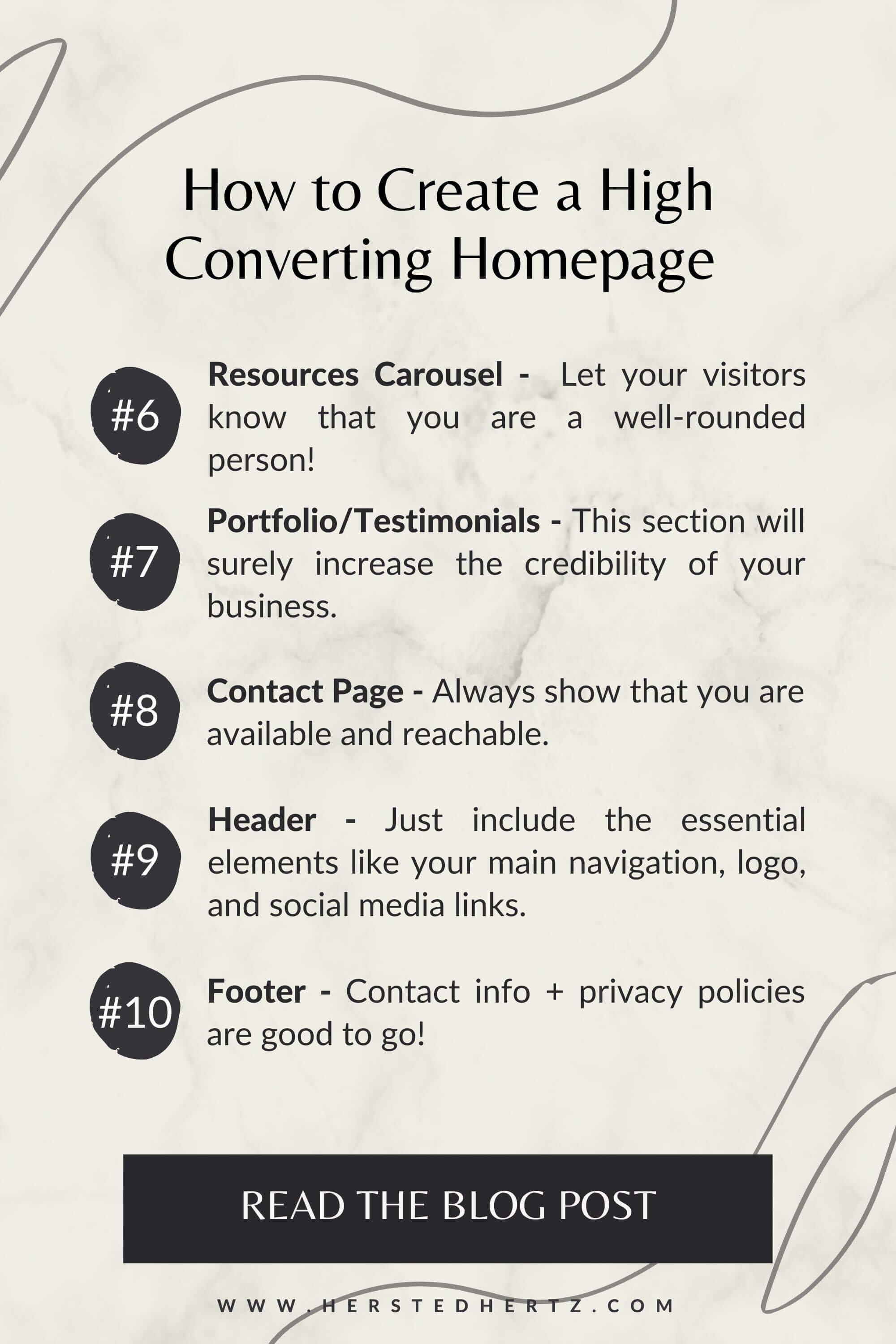
6. BLOG/PODCAST/YOUTUBE RESOURCES CAROUSEL
Let your visitors know that you are a well-rounded person! If you have a blog/podcast/youtube or other resources, showcase them here.
PRO TIP: SEO loves blog posts!
7. PORTFOLIO/TESTIMONIALS
Time to show off your past works and increase the credibility of your business by showing them the experience of working with you.
Who would trust a company with empty reviews, right?
PRO TIP: You can turn your testimonials into blog posts to provide in-depth working experience with you. I talked about that here: 6 Proven Strategies to get a Good Client Testimonial that Sells! + Where to Showcase them
8. CONTACT PAGE
Always show that you are available and reachable.
For example, include a call-to-action that is easily accessible if your client wants to keep in touch with you.
9. HEADER
Your header contains the main navigation of your website.
It usually includes the logo, navigation, and social media buttons, a cart, or a sign-in link for your website.
You must label your CTAs clearly; you don’t want them to mislead where they will be going. Dropdowns are recommended if you have many web pages; it’s also important not to overwhelm your visitors.
It’s great to have options, but too many will make your visitors dominated, and it’s not a good thing!
10. FOOTER
Typically your footer is like the map of your website; it includes your logo, site navigation, social media links, privacy policy and terms of agreement links, copyright, and your contact details.
It’s significant to make your contact information accessible as much as possible so your visitors can reach you whenever you want.
I talked about optimizing your website footer in a separate blog post; check it here: 3 Website Footer Tricks That Can Help Your Business Grow
Website Showcase
Remember, you can mix and match the contents depending on what fits your style and preference.
I HOPE YOU’LL HAVE LOTS OF FUN DESIGNING YOUR WEBSITE HOMEPAGE. IF YOU HAVE ANY QUESTIONS, JUST LEAVE A COMMENT BELOW!
RELATED:
Bonus content!
Starting new things can feel daunting at first. Everyday decisions like trying a new restaurant, buying new skincare or perfume, up to essential things like investing in a website. But you’ll never know what it is like until you decide to give it a try.
I always remind myself that when it comes to making life decisions, whether small or big, it’s okay to try new things. Stepping out of your comfort zone is necessary for growth.
But of course, impulsive decisions are different. So I always reason about it and weigh the pros and cons before making a decision.
SO IF YOU’RE LOOKING FOR A SIGN TO START A WEBSITE, THIS IS IT!
If you liked this post, Pin it to Pinterest!


