Why Mobile-Friendly Design Should be your Number One Goal for your Squarespace Website
Last time, I talked about AMP blog posts as your SEOvior. Accelerated Mobile Pages or AMP blog posts make your page load faster by making it a mobile-friendly design for a quick review. The catch is all your layouts and design will be converted to a simple black header and a Muli font. But of course, the benefit outweighs the cons; thus I really suggest you use it.
If you’re still not convinced by using AMP blog posts, read this: The SEO trick every Blogger avoids using - Why I suggest you should use it.
Note that using AMP blog posts is only a part of a massive chunk of making your site mobile-friendly. Continue reading this for never-before-seen tips and tricks to make your website mobile-friendly, yay!
Related: How to Get Started with Google Analytics + Why you need it!
Why Mobile-Friendly Websites are a must!
To tell you, most users don't possess laptops or personal computers. Unless you are a student or need it for work, most prefer having smartphones and tablets. Why? Because it’s convenient and it’s cheaper. You can bring it anywhere, and they are the easiest way for a quick search.
Thankfully, Squarespace is automatically designed to work well with phones and tablets. That’s why I highly recommend choosing Squarespace for newbies!
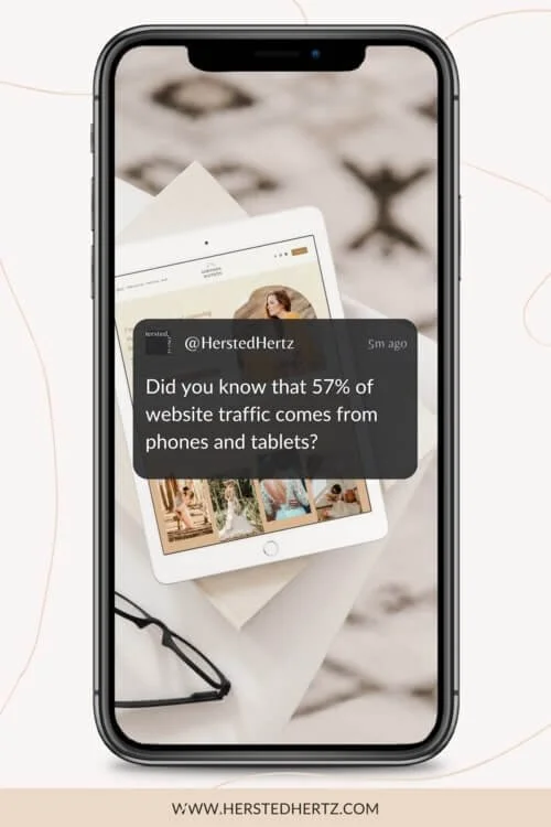
Did you know that 57% of website traffic comes from phones and tablets?
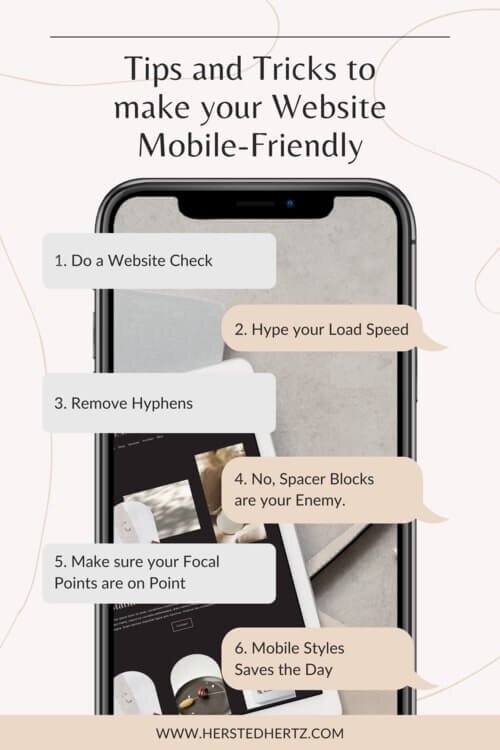
Here are some tips and tricks to make your website more mobile-friendly:
TIP #1: DO A WEBSITE CHECK
Before and after you directly tweak your settings, you need to know your website’s appearance in mobile view. This will serve as your guide on the significant changes you need to make to your website.
Find it here: Page editor > Line at the top of the website > Choose your preferred view.
TIP #2: HYPE YOUR LOAD SPEED
Nowadays, people have a shorter attention span, and if your website takes a long time to load, they’re gone before they can visit your website. Mobile-friendly websites mean that the content is optimized to fit the capacity of a phone or a tablet. You can still make it visually appealing as much as possible. Simultaneously, you increase the user’s experience by making sure navigation is simple and users can easily share your content too!
Some tips!
Keep your webpage content under 5 Mb.
Make your letter spacing 0px or higher.
Maintain images under 500 KB with 1500px to 2500px width.
Don't overdo Galleries; maintain a 50 pictures limit.
If possible, use JPGs.
Also, limit embedded content like videos to reduce page load time.
To know more about how page sizing, visit Reducing page size.
TIP #3: REMOVE HYPHENS
Hyping your website is good, but hyphens are not so. The thing is, Squarespace hyphenates the words too long to fit on one line instantly. You can use a code that removes automatic hyphenation.
Just pop this tiny code by going to Design > Custom CSS:
/* Remove hyphens */p, h1, h2, h3 {-webkit-hyphens: manual !important;-moz-hyphens: manual !important;-ms-hyphens: manual !important;hyphens: manual !important;} The h1, h2, and h3 stand for the headings, and this code removes the hyphen of those. You can also tweak it; just add or remove (h4, h5, etc.) depending on your preference.
TIP #4: NO, SPACER BLOCKS ARE YOUR ENEMY
Spacer blocks are essential for the desktop view since it provides that minimalistic layout by adding space to your website. The thing is, spacer blocks are concealed on mobile devices (in most templates), which can cause layout mishaps.
The good news is you can tweak the padding or use the content inset of some templates.
TIP #5: MAKE SURE YOUR FOCAL POINTS ARE ON POINT!
Images tend to be cropped in the mobile design of your website. To edit your images’ placement, edit the page and the image. Just drag and move the photo depending on your preference. Use the white circle as your guide to ensure that the image is centered.
TIP #6: MOBILE STYLES SAVES THE DAY!
Don't forget to change the font and size, color, and spacing to make it convenient for your users. You should also change your logo size to make it fit for mobile settings.
Just go to Design > Site Styles.
Why all of these are Important?
MOBILE-FRIENDLY WEBSITES AND SEO ARE BEST FRIENDS!
Think of Google as the jury for website rankings. Google literally judges your website, and one thing it hates is not so mobile-friendly websites. As the saying goes, don’t judge the book by its cover. Sadly, Google penalizes your website if it is not designed for mobile users (yikes).
Of course, Google loves mobile-friendly websites so much that your page has a high chance to be on the top list. Who doesn’t want that, right?
BOOK MORE CLIENTS!
Having a mobile-friendly website means that your contact details can be easily seen by your customers. Remember, a happy customer will be more likely to reach you!
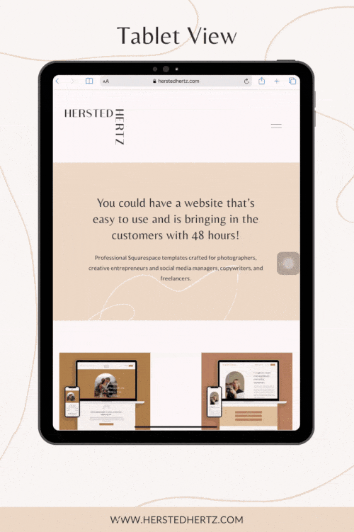
SOME INSPOS!
Visually appealing, right? They look all the same that it’s hard to notice changes made for mobile users. That’s the magic of putting love and effort into your craft. Thank you for listening to today’s episode of making your website mobile-friendly; yay!
Bonus Content!
What’s more important than making your users happy, right?
Their satisfaction means a lot. For some, it’s a plus for booking more clients, and for some, it’s suitable for websites’ analytics. Personally, I want to be sure that I put my best to make each visitor happy because this is what I’m passionate about, to help and to inform. It’s also my way of appreciating the love and support you give since day 1. I always say this, business is essential but making solid relationships and giving out kindness to other people is something you can’t trade money for.
If you liked this post, Pin it to Pinterest!
For more information, visit Squarespace.


